NIRAVASI Devlog (18/05/2021): A Picture Paints

Hey everyone,
It's that time again, after all. Another week has passed and here we have a new Weekly Devlog to cover for NIRAVASI. Last week, I covered a number of topics in the April 2021 Video Devlog from the work done on Ishani Bazaar, to a brand new look for a majority of the games' characters. If you haven't seen it, take a look here:
Gave it a watch? Good, now let's move onto the next topic I wanted to discuss for this week's Devlog. I can't believe it's taken me this long to focus on this element of the game, but better late than ever. This week, we're going to be talking about the use of Logos and Iconography in NIRAVASI and why they're so important. Without further ado, let's get into it.


A Thousand Words
As I've explained in previous Devlogs before, NIRAVASI will be a game that focuses heavily on both environmental and indirect storytelling. Because of this, I wanted an environment for players to explore that wasn't just some abandoned house in the middle of nowhere, or the deepest depths of a hellish land. I wanted to craft a fictional world that players wouldn't expect in an RPG Maker game, as well as one that asks more questions than give answers. I always knew I was going to create a crazy-complicated city, but I needed (and still need) a crazy amount of work done in both the planning and implementation stages. Thankfully, the years spent between my work on BLANK and now were incredibly fruitful, as I significantly improved my skills as not only a Developer, but as a Designer as well. I wanted to show off the imagination I had when it came to Graphic Design and finally found a way to use it in the form of NIRAVASI. But rather than tell you the answer, let me show you what I mean.

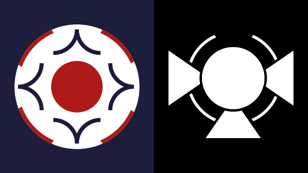
What you see above is a couple of logos for two VERY important fictional companies that play a big part in NIRAVASI's background story. You may recognise these logos if you've played around with the demo, but for those of you that have just come across the project, these logos represent two different companies that worked in unison for a terrible project.
Left: The Niravasi Security Bureau (NSB)
Right: Synergeni
Since these two organisations would play a pivotal role in the 2nd level's story, I wanted to create a series of unique logos that players will recognise when they venture through the later levels of the game.
NSB: For the NSB logo, I used two primary sources of inspiration. The first was the colour scheme of the Punjab Police's logo, which harkens back to the use of Indian culture in the development of NIRAVASI's setting. Additionally, the wavy patterns surrounded the red circle in the middle were inspired by the look of a military corporal rank medal, but far more exaggerated in its look. Finally, I designed this logo to look like an eye after taking inspiration from both the 'Big Brother' show and the concept behind it (in that people in higher positions of power are always watching you), ultimately telling the player that the Niravasi Security Bureau were ruthless in how they enacted the law of the city.
Synergeni: The biggest influence for this logo is obviously the word, Synergy. The idea behind synergy is that a combination of things will lead to an outcome that's greater than the sum of its parts. In the case of Synergeni, 3 completely different smaller companies banded together to create it and they specialise in anything regarding the development and betterment of the human race. As for the logo itself, the concept of symmetry also plays a big role in its design, mimicking the perfected look of a butterfly. As you might expect, there's also a meaning in that as well, but I'll save that little detail for now.
But it's not just the big companies that get their own logos. Even the smaller businesses/places in NIRAVASI get their own brand/identity.

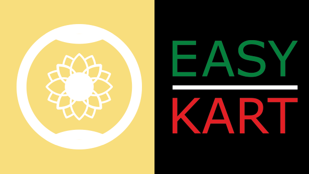
These are the logos for both Lotulanda (the setting of the game's 4th level) and Easy Kart (kinda obvious), a simple store the player can enter in Ishani Bazaar. Clarity is extremely important in a game like NIRAVASI and being able to mentally note down landmarks in your head plays a big part in the philosophy behind this game's design. So if you ever find yourself lost exploring the streets of Ishani Bazaar, just remember that almost every street corner has a new store to explore!

Key Details
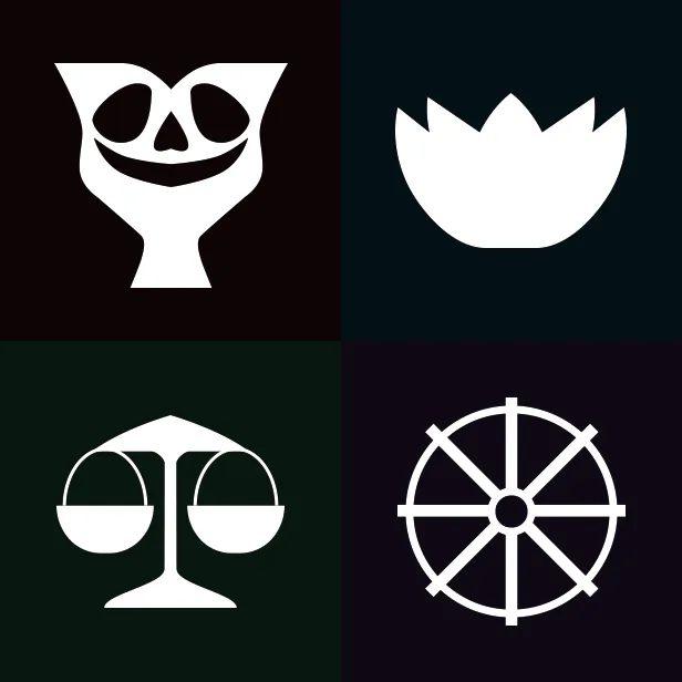
Ishani Bazaar's not the only level in NIRAVASI to include unique looking logos and icons. As you may have also noticed in the game's 2nd level, even the Stepwell of Dhara Hanirr contains some strange, yet alluring icons to make note of. In the image above, you'll find the four icons used to represent the four sectors of the 2nd level.
Top-Left (Circumvention Wing Logo): Right off the bat, the biggest source of inspiration for this icon is the design of the murals found in the Shadow Temple (The Legend of Zelda: Ocarina of Time). When I was a child, these were always the scariest part of the temple for me and was a big part of the reason why I didn't want to go through it as a child. I still remember getting nightmares the first time I saw that thing. However, additional influence comes from the concept of Yamaduta, who were the servants of Yama (the God of the Underworld). The idea behind this logo is that it would be used by the people of the Stepwell to scare off any intruders (didn't work against you though, did it?).
Top-Right (Cleansing Wing Logo): In many Eastern cultures, a Lotus represents purity, enlightenment and rebirth. In NIRAVASI, that meaning is cannibalised in a more twisted way. I won't spoil the story for anybody that still wants to give the game a go, but I will say that perhaps purification is not always a good thing.
Bottom-Left (Committing Wing Logo): Scales such as this are often used to balance items or weigh them against each other. But in the context of law and order, scales are often used as symbols to judge and/or contain those that have turned from the path of decency and fallen down a path of ill-intent. In the game's 2nd level, this logo is used to represent judgement in a sick and twisted form. How that applies here is something I'll keep to myself.
Bottom-Right (Culling Wing Logo): In Eastern culture, there is the concept of the 'Wheel of Life', which explains that the process of life and death is only a part of the greater cycle of existence. Outside this cycle is Yama, the God of the Underworld. Should any souls commit heinous crimes and/or interrupt the flow of the Wheel of Life, their souls are sent to Naraka for punishment and purification. In the context of NIRAVASI's second level, this couldn't be anymore true.
I'm sure you can make a conclusion for yourselves the metaphor that the game's 2nd level was made to represent, but I'll leave it up to you to speculate for yourselves what the answer is. Just know that it's this approach to storytelling that inspired the design of these logos and I look forward to showing what new ones I'll make for later releases of the game's demo builds.

That's all for this week's Devlog for NIRAVASI. As you can see, a lot of work goes into the development of this game's assets and the work on Ishani Bazaar is certainly a testament to that. Things are still going along well and my hope is that I'll be finishing work on Ishani Bazaar VERY soon (sometime around the beginning of June, or even the end of May). First I've got to make a cool looking cinema, a few more apartments, and maybe another shop or two. If you're interested in the development of the game, feel free to check out my social media channels that you can find here.
https://www.facebook.com/groups/941318526618475
https://twitter.com/KingSangos
https://www.youtube.com/channel/UCgZiNK3ArFIUlDU0tVYTbyQ
With that said, thank you all very much for reading this week's Devlog and I'll talk to you all again soon!
Kind regards,
Angus (Sangos)
Get NIRAVASI
NIRAVASI
"There is protection in perfection."
| Status | Released |
| Author | King Sangos |
| Genre | Adventure |
| Tags | 3D, Atmospheric, Dark, Dark Fantasy, Pixel Art, Psychological Horror, RPG Maker, Singleplayer, Story Rich |
| Languages | English |
| Accessibility | Interactive tutorial |
More posts
- NIRAVASI - Patch 1.1.Apr 15, 2024
- NIRAVASI: Patch 1.1. (Livestream Demo)Mar 13, 2024
- NIRAVASI: Now Free to PlayJul 14, 2023
- NIRAVASI: Devlog HiatusAug 10, 2022
- NIRAVASI Devlog (27/07/2022): Building BlocksJul 27, 2022
- NIRAVASI Hotfix: 1.0.3Jul 21, 2022
- NIRAVASI Devlog (20/07/2022): Secrets BuriedJul 20, 2022
- NIRAVASI Hotfix: 1.0.2Jul 15, 2022
- NIRAVASI Devlog (12/07/2022): AftershockJul 12, 2022
- NIRAVASI Hotfix: 1.0.1Jul 12, 2022

Leave a comment
Log in with itch.io to leave a comment.