NIRAVASI Devlog (06/04/2021): Feline Makeover

Hey everyone,
It's me again, wishing you a warm welcome once more! I hope you all had a lovely weekend, especially for those of you like me that live in the UK. We got the wonderful privilege of having a four-day weekend, which was really nice and a great way to recharge my batteries. In case you weren't aware, last week's Devlog was done in the form a video. Many of you came back to me to say that you really enjoyed it, which I'm really happy to hear. As such, I'll be sure to make a consistent trend in the coming months ahead. With that being said, though, it's still very nice to write these weekly Devlogs. It's not too much of a hassle for me to create and it's also a really great way for all of you to get a sneak-peek at the creative mindset I have going into this project. This week's Devlog isn't going to be anything too huge, but let's jump right into it!


Fresh Coat of Paint
Now, if you've been keeping up to date with any of my social media pages or just noticed this little detail somewhere else, you may have noticed that Mura has been given a BIG new redesign. This was a change I kept under the radar for a little bit, but now I feel we're ready to show-off our little protagonist' shiny new look!
First off, let's talk about Mura's Overworld Sprite in the game. In the very first design (Left), Mura was given a very simple silhouette to better make him stand out from the environment. This was because Mura's design was a very rough concept in the beginning of NIRAVASI's development, where I wasn't even sure I was going to be designing a cat protagonist. That'll be a story for another day, but all you need to know is that Mura's design here was more of a template than a finalised design. In his next iteration (Middle), not much has been changed, save for a few little cheek fur that was added. This design was included in the Kickstarter Demo's second version to see what all of you would think. While I still adore this design, Mura's look eventually started to wear down on me. Sure, he looks adorable and that's a big part of why he looks the way he does, but he didn't have a recognisable design (plus if I can be honest, he looks as if he has massive shoulders here).
The newest design (Right) is something I've been working on behind-the-scenes and am really happy with how it's turned out. Basing this look on both Savistuff's design (the Kickstarter Thumbnail Image) and another design I'll be talking about after this, it gives Mura a really cool look. The bulked-up cheek fur and hair tuff really gives him a lot of character, while still retaining the general silhouette and look of his previous designs. As a bonus, I've been told he looks a LOT cuter like this, so consider that an extra bonus! But as I just said, it won't only be his Overworld Sprites that will be updated. Let's take a look at some of his new Facial Sprites as well!
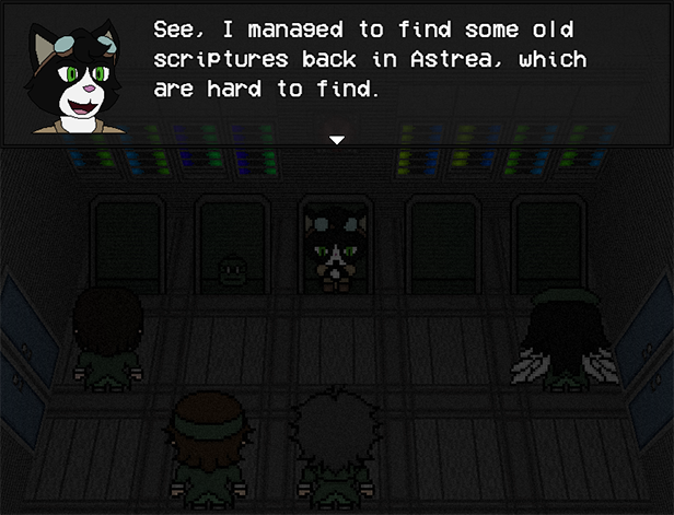
A Handsome Devil
Many of you that played NIRAVASI have applauded the game's visual design and feel, and I'm always really happy to hear that! However, if there's one point of criticism the project has faced in that regard, it's the design and look of the characters' facial sprites. Now this is something I know is one of my weaknesses. I've always enjoyed designing surrealistic monsters than realistic human-like characters. This was also brought up as an issue during BLANK's early days, but I gave that game the benefit of the whole experience being surrealistic. However, one of the core philosophies for NIRAVASI was to create a more grounded-in-reality experience, so the facial sprites that exist right now aren't going to work out. I just wanted more feedback regarding this before I made the jump, so here's what you'll be getting from this point forward!
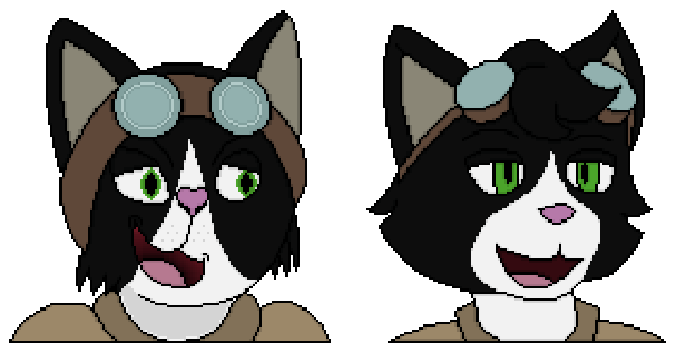
With the help of a very good friend of mine, ZeeMadMaverick, ALL of the characters in NIRAVASI will have their facial sprites cleaned up and redesigned (except AEON's; he stays). As of this moment, only the happy facial sprites for Mura have been completed, but my hope is that as time goes on, I'll be able to show you what the new characters look like when it's all done. Above is a comparison between the Old (Left) and New (Right) designs, which better reflect just how dramatically a change there is. What I really love about this design is that basically just tidies the silhouette of Mura's design, rather than break it. Mura's design is something I didn't want to be changed too dramatically, but Maverick's design of the character was something I really adored and felt it only appropriate that he had more liberties on its design, hence the tuff of fur on Mura's forehead. Here's a collection of all the sprites, side-by-side.
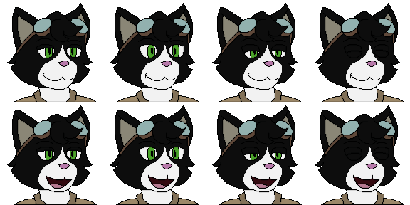
It is my hope with these new updated facial sprites that players will be able to better empathise with these characters, as well as keep the consistency of the serious tone that I want to paint for this game. Speaking of matters that should not be joked about, let's take a look about the work I've done for Ishani Bazaar really briefly.
Market Crash
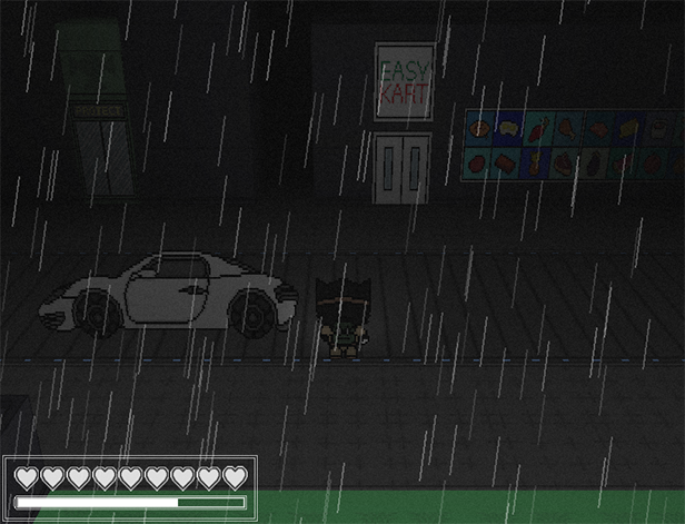
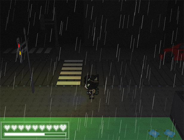
I'm sure you've already noticed this, but yes, that is rain you see in the image above. This was actually a feature I desperately wanted to add near the beginning of the game, but decided against it for mainly two reasons. The first was for technical issues, as I wasn't sure how rain would work well with the RPG Maker MV3D plugin. Weather effects are built into the RPG Maker Engines by default, but are fairly rudimentary in their execution. Furthermore, the rain is merely an image layer pasted on top of the screen and would not work nearly as well with a 3D environment. However, I found an excellent compromise in the form of playing with different camera angles with the MV3D plugin, so that the effect does not appear too jarring for players. The second reason being that Niravasi as a location is essentially a city floating in the outer rim of a planet's orbit, which is exposed to the harsher elements of space. Because of that, combined with the ruined atmosphere, rainfall would be nearly impossible. However, I've managed to implement a story reason within the city itself that explains the rain that happens in the city here. I'm still working on the finer details, but yes, rain will be a main-stay in Niravasi. I'm sure you'll agree that the results are worth it!

That's all for this week's Devlog for NIRAVASI. Sorry this update isn't as significant as last week's was, but you can expect news of the games development to reach a slow pace once again. Work on Ishani Bazaar and other assets will definitely take time, but please let me know as always what your thoughts are on the project so far. I'm always happy to hear from you and will definitely respond as best as I can. Without further ado, I hope you all have a wonderful evening and I'll talk to you again next week.
Kind regards,
Angus (Sangos)
Get NIRAVASI
NIRAVASI
"There is protection in perfection."
| Status | Released |
| Author | King Sangos |
| Genre | Adventure |
| Tags | 3D, Atmospheric, Dark, Dark Fantasy, Pixel Art, Psychological Horror, RPG Maker, Singleplayer, Story Rich |
| Languages | English |
| Accessibility | Interactive tutorial |
More posts
- NIRAVASI - Patch 1.1.Apr 15, 2024
- NIRAVASI: Patch 1.1. (Livestream Demo)Mar 13, 2024
- NIRAVASI: Now Free to PlayJul 14, 2023
- NIRAVASI: Devlog HiatusAug 10, 2022
- NIRAVASI Devlog (27/07/2022): Building BlocksJul 27, 2022
- NIRAVASI Hotfix: 1.0.3Jul 21, 2022
- NIRAVASI Devlog (20/07/2022): Secrets BuriedJul 20, 2022
- NIRAVASI Hotfix: 1.0.2Jul 15, 2022
- NIRAVASI Devlog (12/07/2022): AftershockJul 12, 2022
- NIRAVASI Hotfix: 1.0.1Jul 12, 2022

Leave a comment
Log in with itch.io to leave a comment.